pkb contents > data viz | just under 841 words | updated 01/07/2018
See also notes on graphic design.
My summary of Edward Tufte's approach: Trust the eye as a tool that extracts patterns from complex data. Provide viewers with dense information in high-resolution; maximize information, minimize clutter.
Tufte's principles of analytic design (2006, pp. 225-239):
From Sharda et al. (2014, pp. 110-112):
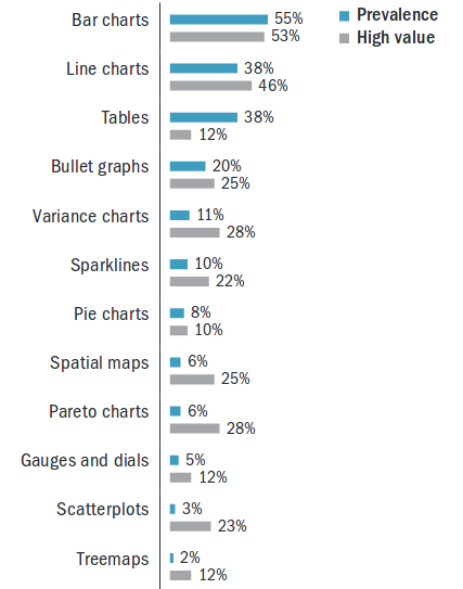
From Eckerson & Hammond (2011):
import matplotlib.pyplot as plt

# convert to int:
my_data = list(map(int, data_in)))

# linecharts/plots:
fig = plt.figure()
ax = fig.add_subplot(1,1,1)
x_axis_ticks = list(range(len(my_data)))
ax.plot(x_axis_ticks, my_data, linewidth=2)
ax.set_title(my_title)
ax.set_xlim([0, len(sample)])
ax.set_xlabel(‘Axis name’)
ax.set_ylabel(‘Axis name’)
fig.save_fig(my_filename)

# table: see also tablib
from prettytable import PrettyTable
my_data_header = my_data[0]
x = PrettyTable(my_data_header)
x.add_row(my_data[1])

# plot all bars as barchart:
X = numpy.arange(len(my_data))
width = 0.25
plt.bar(X+width, prices, width)
plt.xlim(0, 5055)

# plot buckets:
from collections import Counter
def group_data_by_range(my_data):
talley = Counter()
for em in data:
bucket = 0
if em >=0 and em < 10:
bucket = 1
elif em >= 10 and em < 20:
bucket = 2
talley[bucket] += 1
return talley
fig = plt.figure()
ax = fig.add_subplot(1,1,1)
plt.style.use(‘ggplot’)
colors = plt.rcParams[‘axes.color_cycle’]
for group in my_grouped_data:
ax.bar(group, my_grouped_data[group], color=colors[groups[group%len(my_grouped_data)])
labels = [‘Group 1’, ‘Group 2’ … ]
ax.legend(labels)
ax.set_title(‘Title’)
ax.set_xlabel(‘Axis name’)
ax.set_xticklabels(labels, ha=’left’)
ax.set_xticks(range(1, len(my_grouped_data)+1))
ax.set_ylabel(‘Axis name’)
plt.grid(True)p <- seq(0, 1, 0.01)
# scatterplot:
plot(my_df$name1, my_df$name2)
# line:
plot(... type=”l”)
plot(var1 ~ var2))
# univariate boxplot:
boxplot(my_df$var_name)
# multivariate boxplot:
boxplot(var1 ~ var2)
# histogram:
hist(data, breaks=)
# frequencies:
table()
# multivariable:
table(my_df$var1, my_df$var2)
mosaicplot(table(my_df$var1, my_df$var2) )
mosaicplot(var1 ~ var2)
# relative frequencies:
table(my_df$my_var)/length(my_df$my_var)
barplot(table())
# plot in three rows:
par(mfrow = c(3, 1))
xlimits <- range(data1)
hist( … xlim=xlimits)
plot_ss(x = mlb11$at_bats, y = mlb11$runs, x1, y1, x2, y2)
showSquares=T/F
leastSquares=T/F
# OLS best-fit:
lm(y ~ x, my_df)
summary(lm(...)
# line:
abline()
abline(lm(...))
qqnorm(m1$residuals)
qqline(m1$residuals)
hist(m1$residuals)
# account for overlapping data point:
plot(jitter(x), y)Eckerson, W., & Hammond, M. (2011). Visual reporting and analysis. TDWI Best Practices Report. TDWI, Chatsworth. Retrieved from http://www.smartanalytics.com.au/pdf/Advizor-TDWI_VisualReportingandAnalysisReport.pdf
Sharda, R., Delen, D., & Turban, E. (2014). Business intelligence: A managerial perspective on analytics (3rd ed.). New York City, NY: Pearson.
Tufte, E. (2006). Beautiful evidence. Cheshire, CT: Graphics Press.